

In today’s business landscape, where online sales can make or break a company, the key to success in online business is often seen in the optimization of websites for mobile devices. This article explores the importance of mobile site optimization.
Most websites are not truly optimized for mobile
Just five years ago, mobile websites were subpar. The prevalent approach was to simply make the desktop website responsive for mobile, resulting in mobile sites that lacked the wow factor or appeal, and were merely “adapted” rather than truly optimized.
Today, videos and online shopping on smartphones are the norm. With mobile users contributing to 50% or even 100% of sales, the era demands attention to capturing this audience.
However, despite this, the majority of mobile websites are still stuck in the “responsive” era, where mobile-responsive web design was trending, and mobile-friendly websites became more common. Yet, many websites have not evolved beyond this stage.
On the other hand, mobile sites that have adapted to modern marketing trends tend to embody an app-like user experience. They not only secure PC and tablet users but also see an annual increase in sales from mobile users.
Why TCD’s mobile site stands out
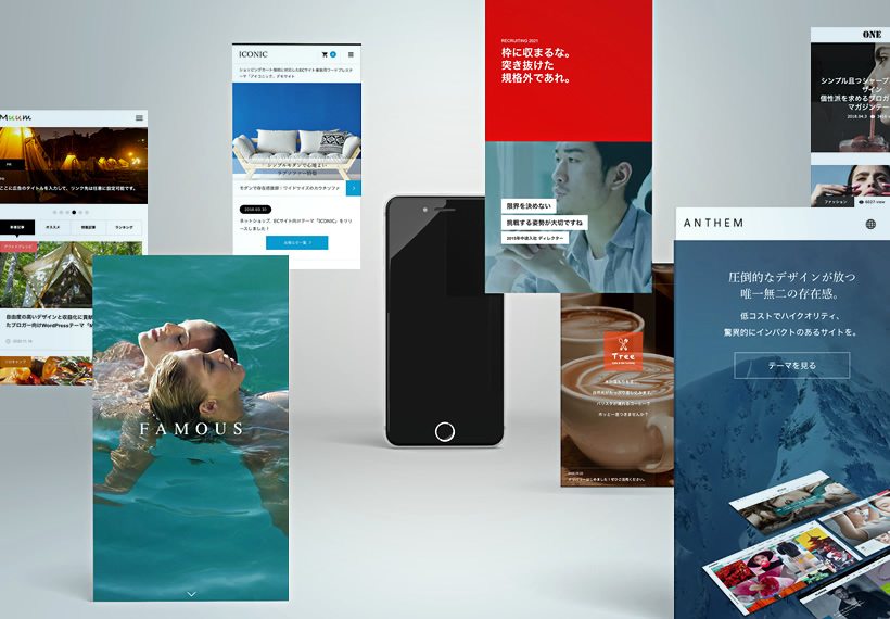
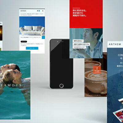
The WordPress theme TCD is designed from the ground up to separate mobile and PC designs. This allows for a true “mobile-first” approach. Here’s why:
- Impressive above the fold
- Optimized global menu for mobile
- Ability to display different content on PC and mobile
- Creative effects
- Footer button for improved conversion rates
- Sophisticated product presentations
Let’s explore each point.
Impressive above the fold

The top page is a crucial gateway to your business. To ensure that it doesn’t appear lackluster on mobile, TCD is designed to make a strong impact with its initial impression.
Global menu optimized for smartphones

Even a simple hamburger menu can make a big difference in user perception when presented creatively. TCD themes offer optimized designs for global menus to enhance user experience on mobile.
Display different content on PC and mobile

Due to the significant difference in display size between PCs and smartphones, showing the same images/text can reduce visibility. For example, a header that is two lines on PC might become five lines on mobile, which looks unprofessional. With TCD themes, you can display different content on PC and mobile, ensuring better readability.
Creative effects

Everyone wants their website on smartphone to look cool. TCD maximizes the vertical screen space of smartphones and pays close attention to developing designs that appeal to users emotionally.
Footer button for easy access to contact information

The footer bar contains buttons that allow smartphone users to easily take action, such as calling, inquiring, or checking the access map. TCD themes allow for a mobile-only footer bar that can be displayed at all times (but can also be hidden).
Sophisticated product presentations

For e-commerce or brand PR purposes, TCD themes prioritize the product introduction page to ensure that smartphone users can make purchases with confidence.
Make your mobile site stylish with TCD
Have you seen the excellence of TCD’s mobile sites? Be sure to check out the demo site on your smartphone. If you find yourself saying “wow,” it’s a sign that the impression has been successfully made.


